If you are a business owner who is frustrated with lack of leads and sales that come to your website, this guide will:
- Help you understand the #1 reason your website doesn’t attract, engage, and help convert visitors to customers
- Give an overview of the Storybrand framework for creating highly engaging and powerful websites
- Provide you a free Storybrand website wireframe template to download
The #1 reason why your website is failing you
Most businesses have websites that resemble a leaky bucket, where customers fall in and immediately fall out.
The issue is that the team or individuals who designed your website focused on wowing your customers with flashy graphics instead of empathizing with the problem your customer faces.
When you neglect your customer’s real problem, you end up with a website that might look great, but fails to convert.
So you’ll waste even more money at Google AdWords and Facebook ads in the hopes that if you just get more people to your site, they’ll be so impressed with your brand that they will say “YES! I’ll buy from you.”
How to identify if the Storybrand marketing framework is right for your business
- Do you have a high bounce rate? Anything above 60% you’re in trouble!
- Is your cost per lead or cost per acquisition so high that you lose money with every customer?
- Does all your traffic come from paid advertising and hardly any from organic or directly?
- Are your competitors outranking you on Google?
- Are you getting traffic but you fail to engage visitors to download your lead generating PDF?
- Does your website pass the grunt test?
- Do you have a clear call to action?
- Are you constantly losing out bids and proposals to your competitors?
- Your copy is cute or clever but lacks clarity?
- Your site tells your story rather than inviting your clients into a story?
If you’ve answered yes to 3 or more of these, you will benefit greatly by crafting and implementing the Storybrand website framework.
If you offer real value to clients through your products and services, then your business owes those clients a website that works.
We know the frustration you must feel, having probably just paid a web agency a lot of money to design your website but it still sucks at engaging your visitors.
So now, you’ve probably downloaded Donald Miller’s 5-part marketing makeover, attended one of Storybrand’s workshops, and purchased an annual subscription to business made simple.
You know more or less what a Storybrand website should sound and look like and you want to tackle redesigning the site yourself.
You know you can’t continue with the website you have as you are losing potential customers.
You imagine having a website that you’re proud of, one that confidently attracts, engages, and converts visitors into valuable customers.
Before you start redesigning your website, the first step is to think through who your customer is, what do they want, and what their problem is.
This is known as establishing your customer personas.
When you design and build a website centred on your customer’s problem, you end up with a site that attracts, engages, and helps gain the trust of your customers.
Popular Customer Personas
From Hubspot buyer persona template to the Business Model Canvas to the Customer Journey Map to Jobs to be Done, there are endless frameworks to uncover your customer personas.
As good and helpful these personas are, I believe the Storybrand framework is as powerful as any framework to help you best understand and uncover what your customer wants.
And the one tool that I trust to create a customer-centric website strategy is the Storybrand Brandscript.
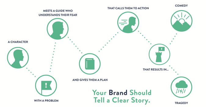
The Storybrand marketing framework overview
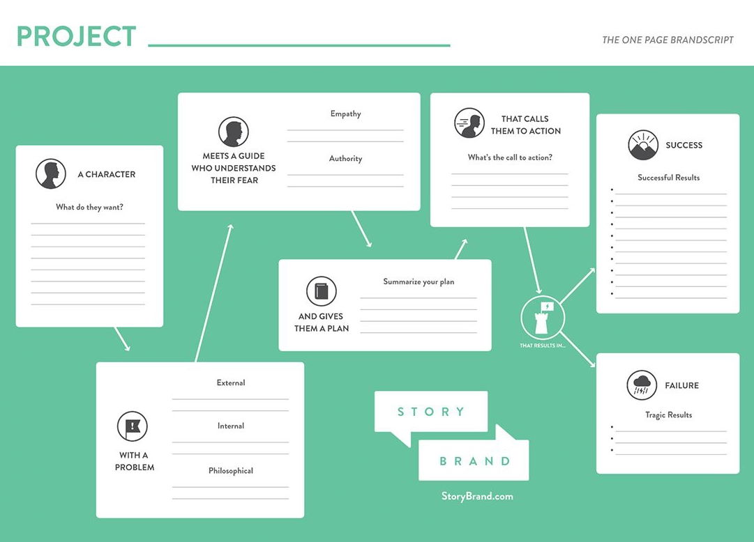
To help you refine your Brandscript, let’s recap the 7-principles of the Storybrand framework:
- Principle #1: What do your customers want?
- Principle #2: What are your customer’s external, internal, and philosophical problems?
- Principle #3: Be the guide, not the hero.
- Principle #4: Give your customers an easy plan to do business with you.
- Principle #5: Be obvious with your call to actions.
- Principle #6: Identify clearly what is at stake.
- Principle #7: Help your customers imagine what success looks and feels like.
Principle #1 – who does your customer want to become?
The story begins when the character (your customer) wants something. But more important than just wanting something, they aspire to become someone.
It is your job to know clearly what your customer wants.
How do you uncover what your customer wants?
- Ask your clients straight-up what do they want
- Be aware that when asked, people tend to list too many things that they want
Examples:
- My business needs more quality leads
- I want a new website that is beautiful but powerful in converting visitors
- I want to successfully homeschool my children (homeschooling platform)
Why this is critical:
Most businesses make the mistake of telling their own story, why they exist, what makes them great or why they started the company. This violates the first and vital Storybrand principle that your customers are the hero, not your brand!
Principle 2: What are your customer’s external, internal, and philosophical problems?
Your customer has a problem that is getting in the way of what they want.
Any good story gets interesting when a conflict is clearly defined. Your brand must always be clear about what the customer’s problem is and it must talk about your customer’s problem.
Their problem consists of a tangible obstacle known as the external problem. As a result, because your customer is experiencing this problem, it’s causing them to experience a negative feeling (internal problem). The final step is to determine why it’s wrong for your customers to feel these external and internal problems.
Let’s take the homeschool mom as an example:
We know she wants to successfully homeschool her children. But the problem is (external) there are too many disjointed tools needed to homeschool.
(Internal) As a result, she feels overwhelmed and frustrated with the number of tools she needs.
(Philosophical) A homeschooling mom deserves one simple but powerful tool that will help her successfully homeschool.
Common Mistakes Brands Make With This Principle:
- We tend to list too many problems
- The problem we defined is not the true problem our customer is experiencing
- We fail to connect the external and internal problems of our Brandscript
Principle 3: Be the Guide, Not the Hero
Your customer is the hero who is desperate for a solution to their problem.
Your business is the guide who has a solution to your customer’s exact problem.
Never play the hero in the story, always play the guide
Before you talk about how you are the best solution to your customer’s desired job, you need to first speak back to the external, internal, and philosophical problem your customer is experiencing.
You do this because it establishes empathy. Before you can help solve their problem, you have to state that you understand and know what the problem is they’re facing.
Then comes the moment you establish authority as a guide. In other words, you want to clearly convey to your customer that you know what their problem is and that you have helped others with similar problems overcome this problem.
Here, social proofs such as testimonials, case studies, and logos of companies you’ve worked with are helpful.
Principle 4: Give your clients an easy step-by-step to move forward
To be the guide, you need to lead well – a greater leader is one who paves the road ahead for others to follow.
Why do you think people need agendas, itineraries, and maps?
Because people want to anticipate the next step. Same thing on your website.
That’s why the 4th StoryBrand marketing principle is to give your customers a step-by-step plan to move forward. If you don’t, there’s a higher chance of them failing to take the next action.
By simply listing three to four steps, you increase the probability of your customer making the leap to do business with you.
Principle 5: What is your main call to action?
Clearly call people to action
What do you want your customers to do? Shop Now, Place an Order, Download Now, or Schedule a Free Call!
That’s your clear call to action – the obvious invitation to do business with you.
In addition to your main call to action, your website needs a transitional call to action. This gives customers a low stake commitment to engage with your business when they’re not ready to buy just yet.
Based on an experiment by Unbounce on call to actions that convert, they uncovered that two questions can help you write effective CTA button copy:
- What is my prospect’s motivation for clicking this button?
- What is my prospect going to get when they click this button?
If you can answer those two questions clearly, you’ll have a strong CTA button.
Make your CTA a call to value – an invitation to receive what the lead already wants. For example, let’s say you are offering a downloadable resource that helps them attract new clients. Your CTA might be ‘Get My Free Resource’ or ‘Start Getting Clients’.
A good test to try to see if your CTA lives up to the “Call to Value” standard: “If your CTA can complete the sentence ‘I want to _’ from the lead’s perspective, you’re in good shape.”
You may notice that framing a call to action as a call to value knocks old standbys like “Submit” and “Download” out of the running. Every element of your landing page needs to work for its lunch, and one-word actions like “Submit” and “Download” just kind of sit there, taking up space.
Principle 6: Have you identified what is at stake?
In the official Storybrand framework – the success principle comes before the failure principle but in action on your website, the problem is agitated before the solution.
So the recommendation is always to start with principle #6 by identifying what is at stake.
If you’ve clearly identified your customer’s problem, it is your responsibility to amplify the consequences of not solving that problem.
Before you paint the picture of the promised land your customer seeks, you must clearly get them to visualize the consequences of not solving the problem.
What is the opportunity cost if things continue the same way? How many potential leads and clients will you lose to your competitors?
Principle 7: Have you helped your hero imagine what success looks like?
This is one of my favorite principles – what does success look like once you have helped the hero successfully solve their problem?
Your aim is to help your client imagine the success they can experience after engaging with your business.
Both imagining success and failure need to be highlighted on your website to effectively motivate your customer to action.
Once you have completed a draft of your Brandscript, it’s time to wireframe a website that works.
There are 10 sections to an effective Storybrand website
- The header
- The stakes
- The value proposition
- The Guide
- The Plan
- The explanatory paragraph
- The video (optional)
- The Price (optional)
- The Lead magnet
- The Footer aka Junk Drawer
1. The Header
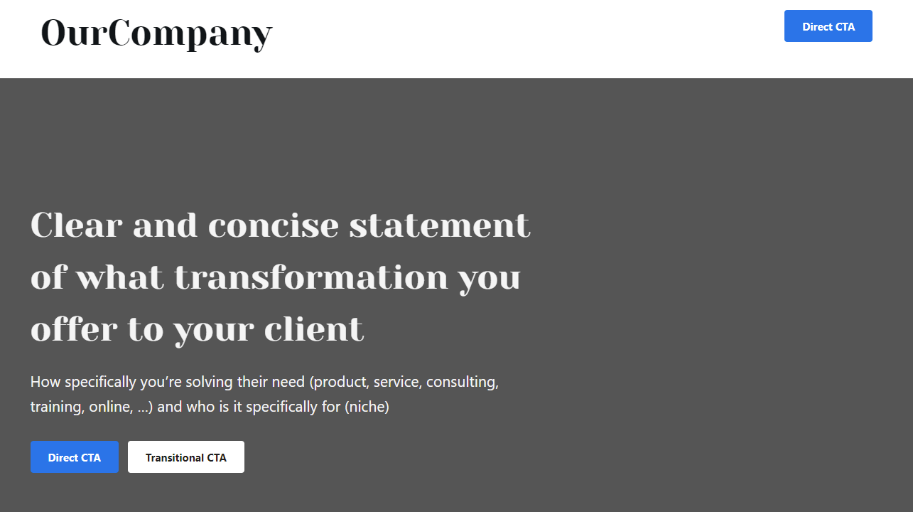
The header is the top section of your website and the first impression a visitor has about your business.
You get this wrong, you lose.
According to Nielsen Norman Group:
Users often leave Web pages in 10–20 seconds, but pages with a clear value proposition can hold people’s attention for much longer. To gain several minutes of user attention, you must clearly communicate your value proposition within 10 seconds.
NNGroup – How Long Do Users Stay on Web Pages?
Your header needs to include:
- A clear and concise statement of what you offer.
- A relevant image that represents your product or clients. This could also be a video background that communicates how your product makes your customer’s life better
And, answer three questions that customers visiting your Site are asking themselves:
- What do you offer? This is your clear and concise statement of what you offer
- How will it make my life better? 3 points that highlight what your customer will gain from what doing business with you
- How do I buy it? Yes, a clear call to action i.e. Schedule a Free Call, Buy Now
2. The Stakes
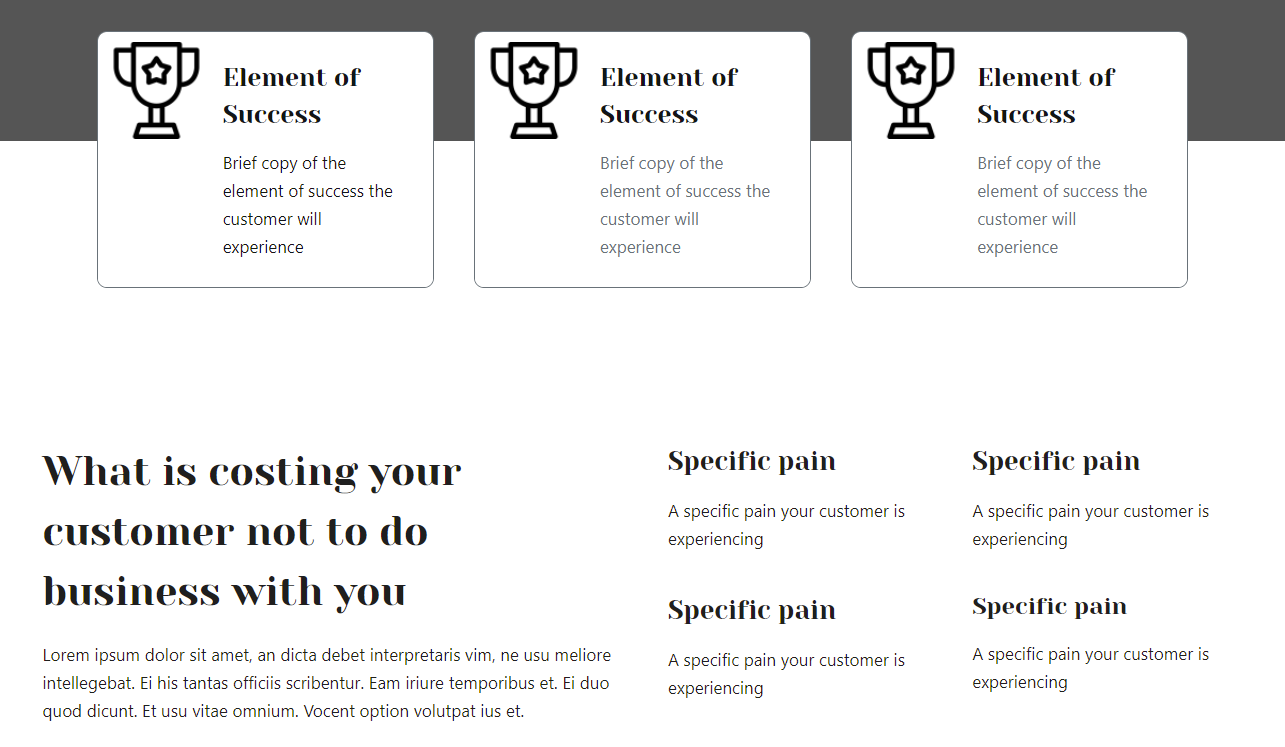
This is where you talk about the problem your customer faces and the cost of not doing business with you.
Go back to your Brandscript, and look at principle #2 and principle #7. Use language from the failure bucket you came up with. Your client needs to know what they’re losing if they fail to engage with your product/service.
This also helps offset the price of your product.
For example: if your service costs $10,000 but the client stands to gain $110,000 from using your services, they need to know they’re losing at least $100,000 by not doing business with you.
3. The Value Proposition
The essence of marketing is the message and the essence of the message is the value proposition.
Flint McGlaughlin
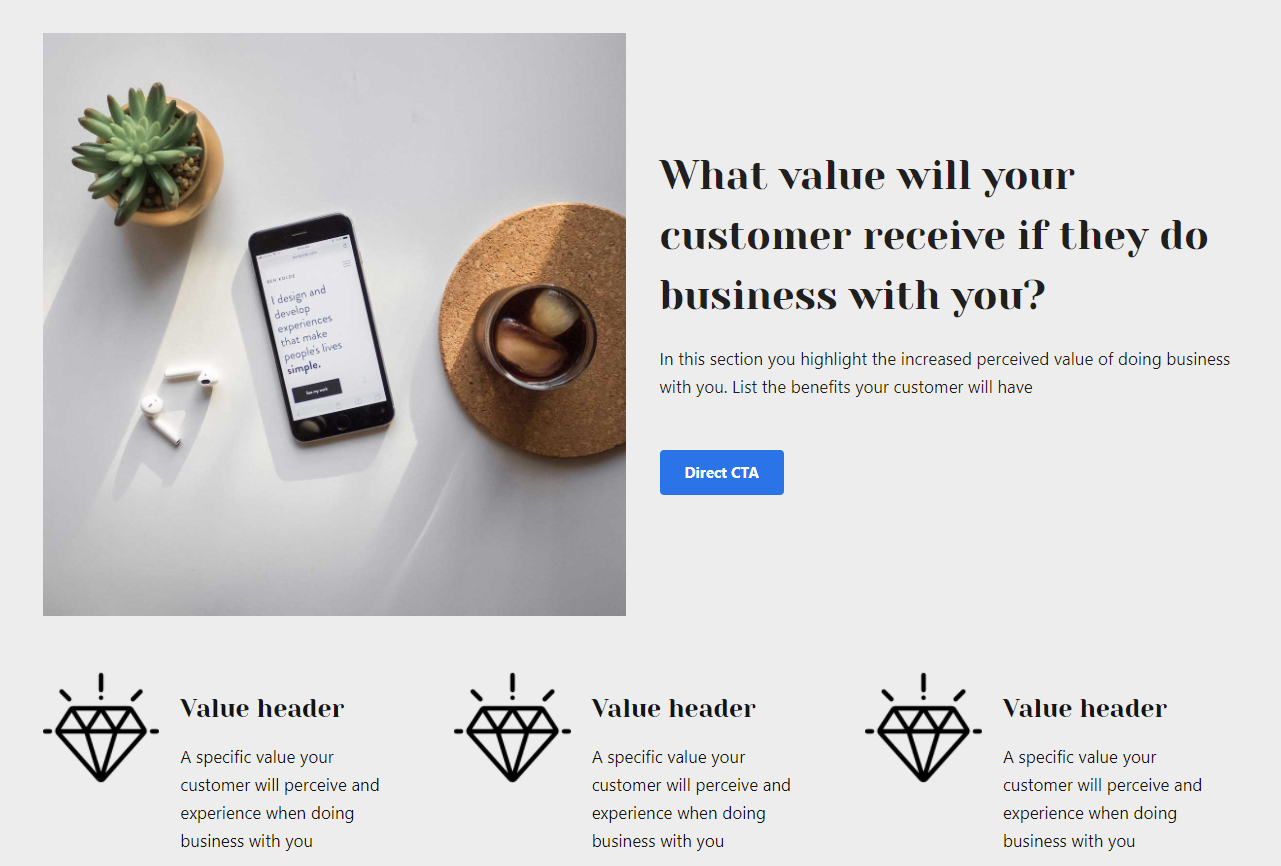
The stake section above highlights what you are helping your customers overcome or avoid and in the Value Proposition section, you highlight what value will your customer get if they do business with you.
Another way to look at this through the lens of your customers. “If I’m your ideal customer, why should I buy from you rather than your competitors?”
Your value proposition helps your prospective clients understand what they get in exchange for giving you their money.
Ensure your value propositions are specific and be visual. You need to ask only two questions to get specific and clear:
- What’s in it for me?
- Why you and not one of your competitors?
For example, will your product or service:
- Save customers money?
- Save them time?
- Will it reduce their risk?
- Will it simplify their life or help them avoid a hassle?
If you sell custom jewelry your value proposition could be:
- Pay on average 25% less on the highest quality diamonds
- Design a custom ring that matches the style of the one you love
- Free lifetime cleaning service with every custom ring
You want to list at least 3 or 4 added values your customer will receive when they do business with you.
4. The Guide
My goal as a guide is not to take my client’s money, but to provide a surprising return on their investment. The only way I can be successful at that, is by making sure their business is successful.
Essentially that is the role of the guide – you need to be committed to helping your customers overcome their problems.
As a guide, you’re going to fall in love with your customer’s problem.
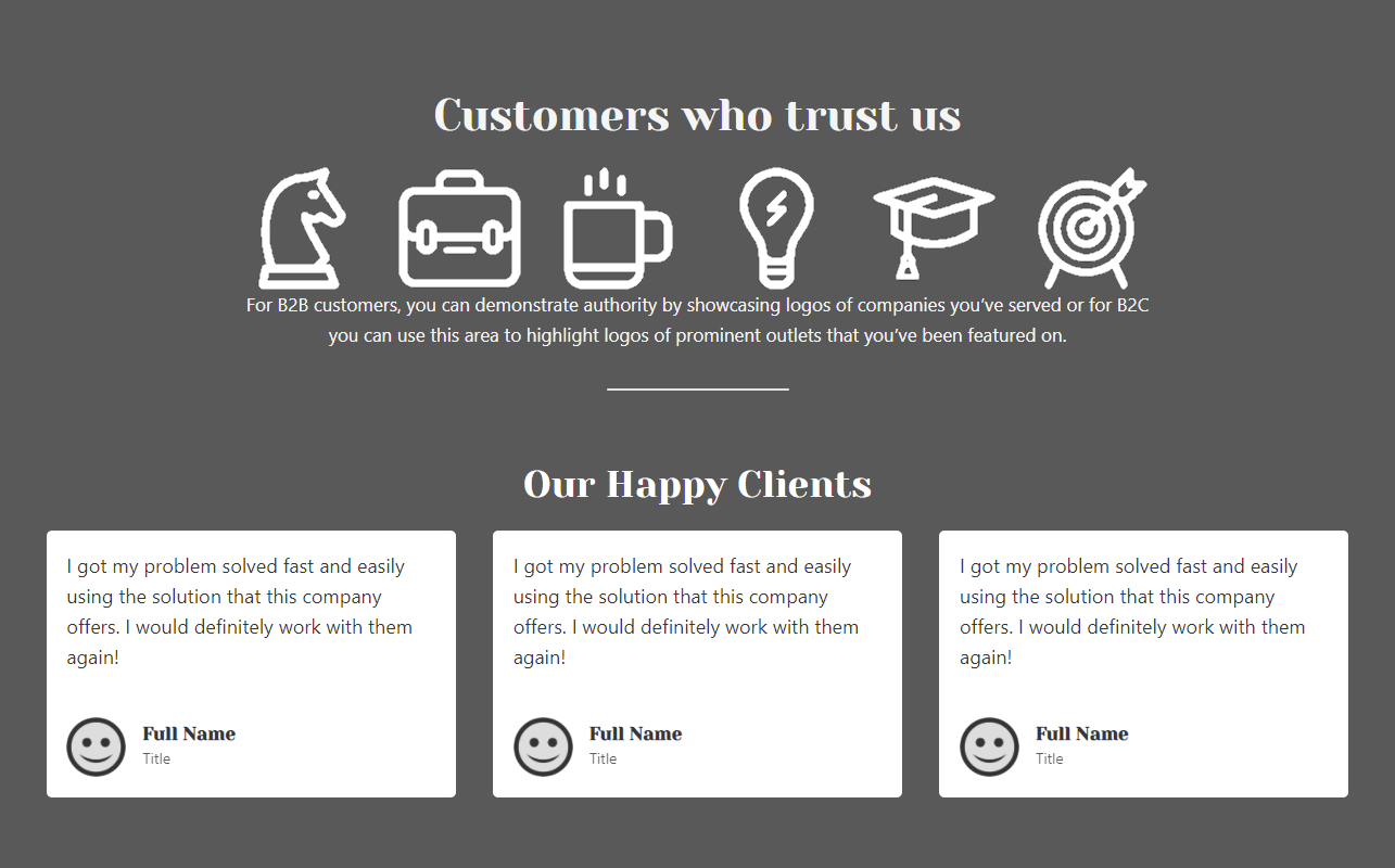
In this section of your website, you want to clearly express empathy for the problem/challenge your customer is facing, while demonstrating credibility (or competency).
Here are a few examples:
- Testimonials like Google Reviews
- Case studies of before and after
- Logos of companies you’ve worked with
- Stats of how many people you’ve helped or number of clients you’ve helped
5. The Plan
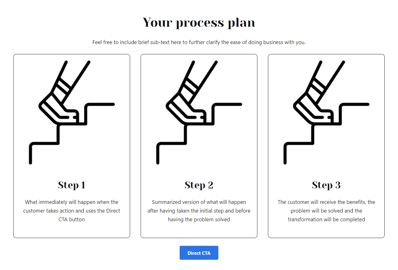
This is simply the process plan in how your customer can do business with you. The Storybrand framework recommends a three-step plan. You can use four, but it’s recommended to keep to three.
What I love to do here is also add an incentive to help customers to take an action. Here are a couple of examples:
6. The Explanatory Paragraph
What’s more important, brevity or clarity?
Think about that for a moment – most websites make the mistake of having copy that leans on declaring things but fall short on helping customers understand.
It’s not about brevity but clarity. Clarity always trumps brevity.
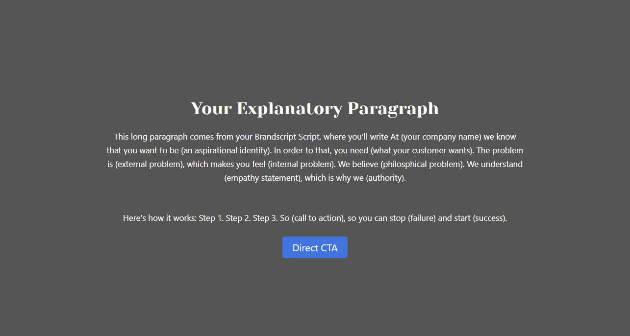
The best use of this section is to include the copy from your Brandscript. The explanatory paragraph could also benefit your SEO.
7. The Video (optional)

One effective use of video is to use your Brandscript copy. This is where you as the business owner can speak directly to your potential customer about their unique challenges.
To increase video engagement:
- Test different video thumbnails (covers)
- Add a headline above your video
- Make sure the video looks and feels like a video (so make the video player big)
To increase audience retention:
- Be sure to keep your videos short.
- If you see a major drop-off in the first 20 seconds (every video will lose a lot of people, some will lose like 80%), it means your opening needs work 😀
8. The Price (optional)
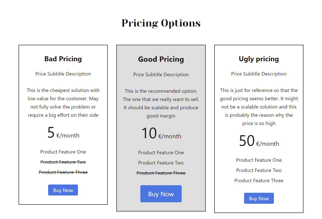
It will not always be possible to give a fixed price, especially when it comes to services that will depend a lot on the specific needs of the client. It is still important to give the customer some indication of what the price range is, as in the absence of information many customers may be left in doubt as to whether it is too expensive for them and will not even make contact. Or, conversely, they may contact to realise during the conversation that the price does not suit their needs, thus wasting both the customer’s and our time. Using terms such as “exclusive” or “tailor-made” reinforces the feeling that the price may be expensive (and therefore excludes customers who may invest little). Conversely, terms such as “affordable” or “reasonable” support the idea that the product is for any budget.
If it is possible to give a fixed price for the product or service it should be done in a clear way.
People need to have a reference price to decide what is expensive or cheap, which is why it is common to use the technique of the ugly, the good and the bad.
- The good one is the one you, as a company, want to sell
- The ugly one is the most basic and simple, which will only interest those who cannot afford the good one but lose important functionality
- The bad one is the most expensive and offers services, usually unnecessary for the regular customer
By showing those three prices side-by-side the client has some references (and therefore will stop looking elsewhere) and will positively value the good one (which is the one we are interested in) because he will see that it gives us what he really wants at a reasonable price. If the ugly and bad prices were not shown then the client could, in the absence of references, be left with the doubt of whether it is a correct price or not and then start looking for alternatives or simply postpone the decision.
9. Your Lead Magnet
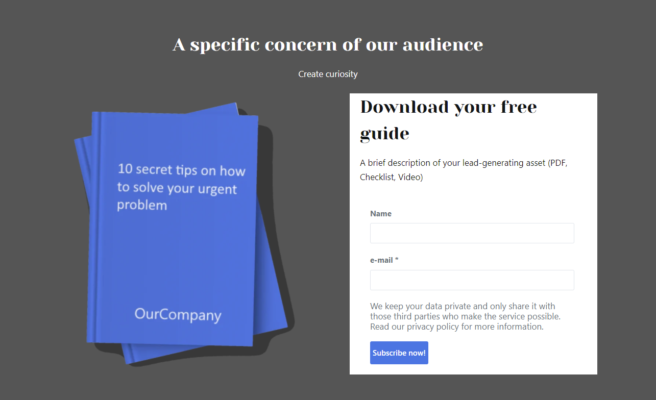
Every good website has an effective lead generating asset where you give value for free for an exchange of an email address.
If you’ve read my article about why StoryBrand lead generators are so persuasive, you know that when you provide value for free, customers feel indebted to you and your brand – even if it’s not conscious. When you give away great content and value, customers want to return the favor and are more likely to want to do business with you.
Make sure in this section you include:
- A description of your lead-generating asset
- Ensure it offers immediate value to your clients
- And that it creates a sense of reciprocity
10. Junk Drawer (Your footer)

All those links you used to highlight on your main navigation are now put down below, in your junk drawer.
You want to keep your main navigation bar clean to prevent decision fatigue and direct visitors to your main call to action and transitional call to action.
The footer is a perfect place to include your About, Careers, Social Media Links, and FAQ.
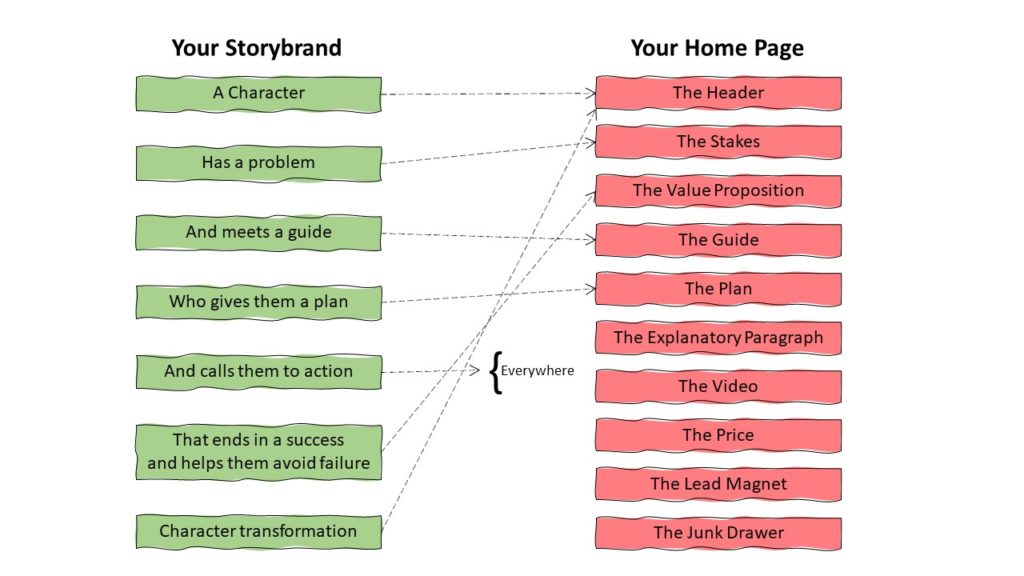
How to tell your story on your homepage?
The elements of your brandstory are the basic pieces that need to be explained to your audience. The way to explain them following the order proposed for the structure of the homepage is as follows:
Helpful Storybrand Resources
- Visit Mystorybrand.com to build your Storybrand brandscript
- Download the Storybrand website template for free
- Contact me to help you design the effective website you need to achieve results

